 misswell
自定义一个微信小程序多功能模态框,可以输入文本 textarea,可以多选列表 CheckBox
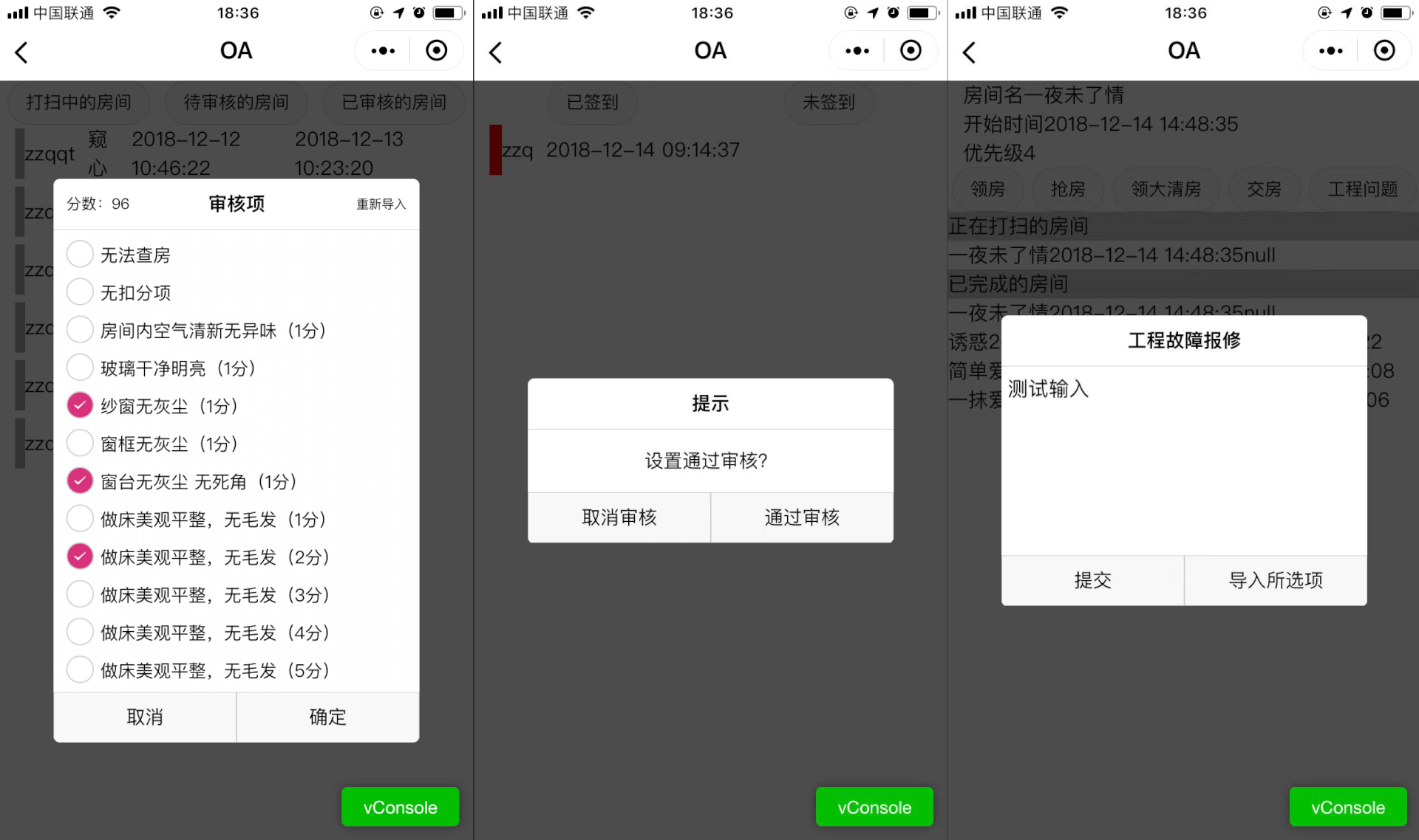
组件
/components/modal/index.js
const app = getApp()
Component({
  properties: {
    show: {
      type: Boolean,
      value: true
    },
    title: {
      type: String,
      value: '标题'
    },
    moreRight: {
      type: String,
      value: ''
    },
    moreLeft: {
      type: String,
      value: ''
    },
    content: {
      type: String,
      value: '内容'
    },
    list: {
      type: Array,
      value: [
        {
          title: '测试',
          id: ''
        }]
    },
    bg:{
      type:Boolean,
      value:true
    },
    mode: {
      type: String,
      value: 'content'
    },
    btnLeft: {
      type: String,
      value: '取消'
    },
    btnRight: {
      type: String,
      value: '确定'
    }
  },
  data: {

  },

  methods: {
    _none:function(){
      //nothing
    },
    _hideDialog(){
      this.setData({
        show:false
      })
      console.log('hide')
      this.triggerEvent('tapBg')
    },

    _showDialog() {
      this.setData({
        show: true
      })
    },
    _textarea(e){
      console.log(e.detail.value)
      var value = e.detail.value
      this.triggerEvent("myInput",value)
    },
    _tapLeft() {
      this.triggerEvent("tapLeft")
    },
    _tapRight() {
      this.triggerEvent("tapRight")
    },
    _moreRight() {
      this.triggerEvent("moreRight")
    },
    _moreLeft() {
      this.triggerEvent("moreLeft")
    },
    _checkboxChange(e){
      // console.log(e.detail.value)
      var value = e.detail.value
      this.triggerEvent("select", value)
    },
  },
})
/components/modal/index.json
{
  "component": true
}
/components/modal/index.wxml
<view class="mask" style="{{show?'z-index: 1;opacity:0.7':''}}"></view>
<view class='modalBg' bindtap='_hideDialog' wx:if="{{show}}">
  <view class="modalDlg" catchtap='_none'>
    <view class='_modalTitle'>
      <view catchtap='_moreLeft' class='_more-left'>{{moreLeft}}</view>
      <text class='_title'>{{title}}</text>
      <view catchtap='_moreRight' class='_more-right'>{{moreRight}}</view>
    </view>
    <view wx:if="{{mode=='content'}}">{{content}}</view>
    <textarea wx:if="{{mode=='textarea'}}" bindinput='_textarea' value="{{content}}">
    </textarea>
    <scroll-view scroll-y="{{true}}" wx:if="{{mode=='list'}}">
      <view class='_check-container'>
        <checkbox-group bindchange="_checkboxChange">
          <label class="checkbox" wx:for="{{list}}" wx:key="{{key}}">
            <checkbox value="{{item.id}}" />
            <text class='checkbox-text'>{{item.title}}</text>
          </label>
        </checkbox-group>
      </view>
    </scroll-view>
    <view class='button-container'>
      <button catchtap="_tapLeft">{{btnLeft}}</button>
      <button catchtap="_tapRight">{{btnRight}}</button>
    </view>
  </view>
</view>
/components/modal/index.wxss
/* 自定义模态框 */

.mask {
  width: 100%;
  height: 100%;
  position: fixed;
  top: 0;
  left: 0;
  background: #000;
  z-index: -99999;
  opacity: 0;
  transition: opacity 0.5s ease;
}

.modalBg {
  width: 100%;
  height: 100%;
  display: flex;
  flex-direction: row;
  justify-content: center;
  align-items: center;
  position: fixed;
  left: 0;
  top: 0;
  z-index: 2;
}

.modalDlg {
  width: 580rpx;
  min-height: 200rpx;
  max-height: 900rpx;
  position: relative;
  z-index: 9999;
  background-color: #fff;
  border-radius: 10rpx;
  /* display: flex;
  flex-direction: column;
  align-items: center;
  justify-content: space-between; */
  overflow: hidden;
}

.modalDlg>view {
  font-size: 30rpx;
  min-height: 60rpx;
  display: flex;
  flex-direction: row;
  justify-content: center;
  align-items: center;
}

.modalDlg>view:first-child {
  height: 80rpx;
  font-weight: 700;
  width: 100%;
  border-bottom: 1rpx solid #ccc;
  display: flex;
  flex-direction: row;
  justify-content: space-between;
  align-items: center;
}

.modalDlg>view:nth-child(2) {
  height: 100rpx;
  margin: 0 40rpx;
}

.modalDlg>view {
  display: flex;
  flex-direction: row;
  justify-content: center;
  align-items: center;
}

.modalDlg>view>button {
  width: 290rpx;
  height: 80rpx;
  font-size: 30rpx;
  border-radius: 0;
  display: flex;
  flex-direction: row;
  justify-content: center;
  align-items: center;
  border-top: 1rpx solid #ccc;
}

.modalDlg>view>button:first-child {
  border-right: 1rpx solid #ccc;
}

.modalDlg>view>button::after {
  border-radius: 0;
  border: none;
}

._modalTitle {
  display: flex;
  flex-direction: row;
  justify-content: space-between;
  align-items: center;
  position: relative;
}

._title {
  margin: 10rpx;
  text-align: center;
  width: 560rpx;
  padding: 10rpx;
}

._more-right {
  position: absolute;
  right: 20rpx;
  font-size: 20rpx;
  font-weight: 400;
}

._more-left {
  position: absolute;
  left: 20rpx;
  font-size: 25rpx;
  font-weight: 400;
}

scroll-view {
  height: inherit;
  width: inherit;
  overflow: hidden;
  max-height: 735rpx;
}

._check-container checkbox-group {
  display: flex;
  flex-direction: column;
  justify-content: flex-start;
  align-items: flex-start;
  background-color: #fefefe;
  padding-left: 20rpx;
}
使用方法
/pages/test/test.json
{
  "usingComponents": {
    "my-modal": "/components/modal/index"
  }
}
/pages/test/test.wxml
<my-modal title="{{modal.title}}" mode="{{modal.mode}}" show="{{myModalShow}}" content="{{modal.content}}" btn-left="{{modal.btnLeft}}" btn-right='{{modal.btnRight}}' bind:tapLeft="{{modal.tapLeft}}" bind:tapRight="{{modal.tapRight}}" bind:tapBg="tapBg"></my-modal>/pages/test/test.js
  myModalShow: function() {
    console.log('myModalShow')
    this.setData({
      myModalShow: true
    })
  },

  myModalHide: function() {
    this.setData({
      myModalShow: false,
      modal: {},
    })
  },
  showit:function(){
    var modal = {
      mode: 'content',
      content: '这是内容',
      title: '提示',
      btnLeft: '取消',
      btnRight: '确定',
      tapLeft: 'myModalHide',
      tapRight: 'do',
    }
    that.setData({
      modal: modal,
    })
    that.myModalShow()
  },
/pages/test/test.wxss
checkbox-group {
  display: flex;
  flex-direction: row;
  justify-content: space-between;
  align-items: center;
}

.checkbox {
  display: flex;
  flex-direction: row;
  justify-content: center;
  align-items: center;
}
.checkbox-text {
  font-size: 25rpx;
}

/*  重写 checkbox 样式  */

checkbox-group{

  font-size:28rpx;
}
checkbox-group label{
  line-height:60rpx;
}
checkbox-group label:first-child{
  margin-top:10rpx;
}

/* 未选中的 背景样式 */

checkbox .wx-checkbox-input {
  border-radius: 50%; /* 圆角 */
  width: 40rpx; /* 背景的宽 */
  height: 40rpx; /* 背景的高 */
  margin-top: -8rpx;
}

/* 选中后的 背景样式 (红色背景 无边框 可根据UI需求自己修改) */

checkbox .wx-checkbox-input.wx-checkbox-input-checked {
  /* border: none;  */
  background: rgb(217, 50, 124);
}

/* 选中后的 对勾样式 (白色对勾 可根据UI需求自己修改) */

checkbox .wx-checkbox-input.wx-checkbox-input-checked::before {
  display: flex;
  border-radius: 50%; /* 圆角 */
  width: 20rpx; /* 选中后对勾大小,不要超过背景的尺寸 */
  height: 25rpx; /* 选中后对勾大小,不要超过背景的尺寸 */
  line-height: 25rpx;
  text-align: center;
  font-size: 20rpx; /* 对勾大小 30rpx */
  color: #fff; /* 对勾颜色 白色 */
  background: transparent;
  transform: translate(-50%, -50%) scale(1);
  -webkit-transform: translate(-50%, -50%) scale(1);
}